

Background & Primary Goal
Zeit specializes in innovative time travel tourism and aims to sell travel packages to customers over a well-branded and reliable e-commerce website. The company strives to turn people’s dreams into a reality, by enabling them to travel to any of 289 destinations from all over the world and across different time periods in history.
Primary Goal: Design a site responsively (desktop, tablet, and mobile) that makes booking a time travel experience as easy as booking on any modern travel agency website.
My Role: Researcher, UX/UI Designer
Client: Zeit
Project Timeline: Approx. 5 weeks
Key Design Tools: Sketch, InVision
Process

Research
Research Goals | Competitive Analysis | Market Research | Interviews
Research Goals
Validate assumption that current travelers (and website/app users), would help make up the target audience.
Gain insights on pains & gains of booking travel packages online, and discover what makes users trust the booking experience.
Understand the users’ thought process when booking travel, and why certain booking websites are preferred over others.
Understand motivations behind why users want to travel & see other parts of the world, as well as human perceptions around booking time travel trips.
Competitive Analysis
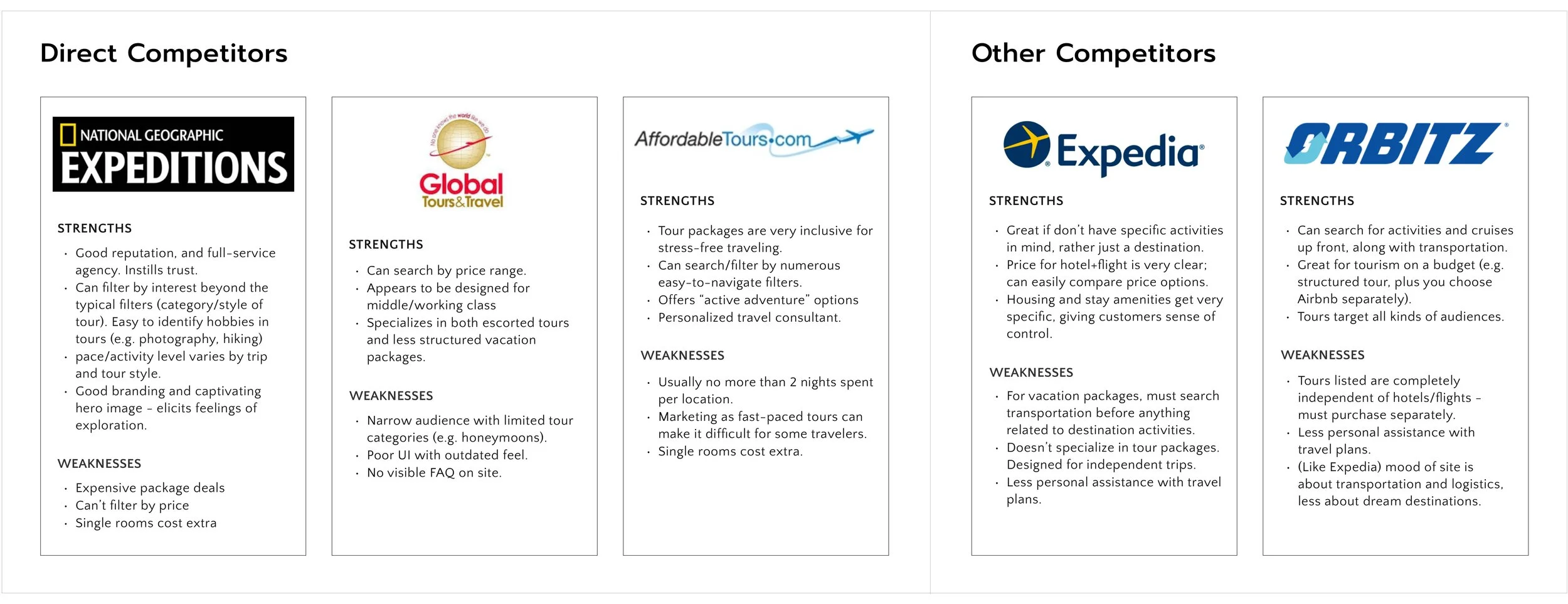
Since a time travel booking company like Zeit could best be compared to the existing travel and tourism industry, I wanted to examine how some existing travel sites function. I analyzed the strengths and weaknesses of both direct competitors (full service agencies responsible for packaging, selling, and operating tours) and less direct, other competitors (that sell and administer travel tours/packages on behalf of the operators and suppliers).
Market Research

Interviews
I conducted 4 interviews with men and women, ages 25-60. To maximize the value by engaging with potential customers of Zeit, target participants met the following criteria:
Young adults, both men and women
English speakers
Individuals that are in good health
Frequent travelers that use tourism and booking apps/websites
Individuals that are interested in history, anthropology, culture, travel, adventure, and/or innovation
Key Insights:

Define
Persona | Empathy Map | Storyboard | Card Sorting | User/Business Goals | Sitemap | Task Flow | User Flows
Persona
I created this primary persona based on the data collected from the 4 interviews conducted. Kendal represents young adults who love to travel and book trips online, but who are also cautious in their decision-making. Having a primary persona like Kendal helps to get inside the heads of target users for the Zeit site.

Empathy Map
The empathy map for Kendal was created after completing her persona. The colored cards divided into sections here directly represent many of the findings from the interviews. Empathizing with Kendal inspired many of the design decisions for the Zeit pages.

Storyboard
After empathizing with Kendal, I got into her head further by telling her story via a storyboard. These 7 sketches and captions illustrate what Kendal thinks and feels as she begins exploring what her next trip might be.

Card Sorting
To help evaluate the information architecture of Zeit, I facilitated a card sorting exercise with 4 participants. They were asked to categorize 30 cards—each with an event or time period listed on it—in any way that made sense to them. Half the participants did the activity in person, and the other half completed it using the OptimalSort online software.

User/Business Goals
Just as it’s imperative to take into account the user goals, it’s important to understand the details and scope of the business goal (often, with overlap between the two). I’ve created a Venn diagram to brainstorm these goals and to further help inspire design decisions.

Sitemap
Creating a sitemap enabled me to understand where and how features and pages would function in the site. Once the structure of the site was mapped out, it was possible to create both the task and user flows to start bringing the project to life.

Task Flow
The more linear task flow shows the basic path to how a user like Kendal would browse trips and eventually book.

User Flows
I then created 3 user flows, each with a different task.
The first is based on understanding Zeit and time travel.

The second is based on browsing trips and saving favorites for later.

The third shows the decision points when choosing a trip to book.

Design
Low-Fi Sketches | Mid-Fi Wireframes | Logo Design | Responsive UI Screens | UI Kit
Low-Fi Sketches
I sketched multiple versions of how the homepage of Zeit might look, based on the research findings and deliverables prior. It was important to include sections that enable users to explore trips, as well as a section to instill trust (e.g. expertise, how time travel works).

Mid-Fi Wireframes
I then translated my homepage sketches into mid-fidelity wireframes, and additionally designed other key pages of Zeit. Homepage interactive components (e.g. timeline, map), direct users to the “Search Trips” page. From there, clicking on a trip card directs users to view the “Trip Details”. The “Sign In” window would display when users click in the top navigation bar or want to “favorite” trips. The ”About” page was designed at this level, since interview participants expressed their needs to trust Zeit and its time travel methods.

I designed responsive wireframes for both the “Homepage” and “Search Trips” page of Zeit (below). While the desktop and tablet versions remained relatively similar, here are a few ways the designs changed for mobile:
The top navigation is shown as icons.
Sections show cards and components as vertical (e.g. timeline).
The map on the homepage changes to a carousel with words.
Filters to search on the “Search Trips” page are initially hidden from view, but would appear upon clicking “Narrow Search” and “Sort By”.

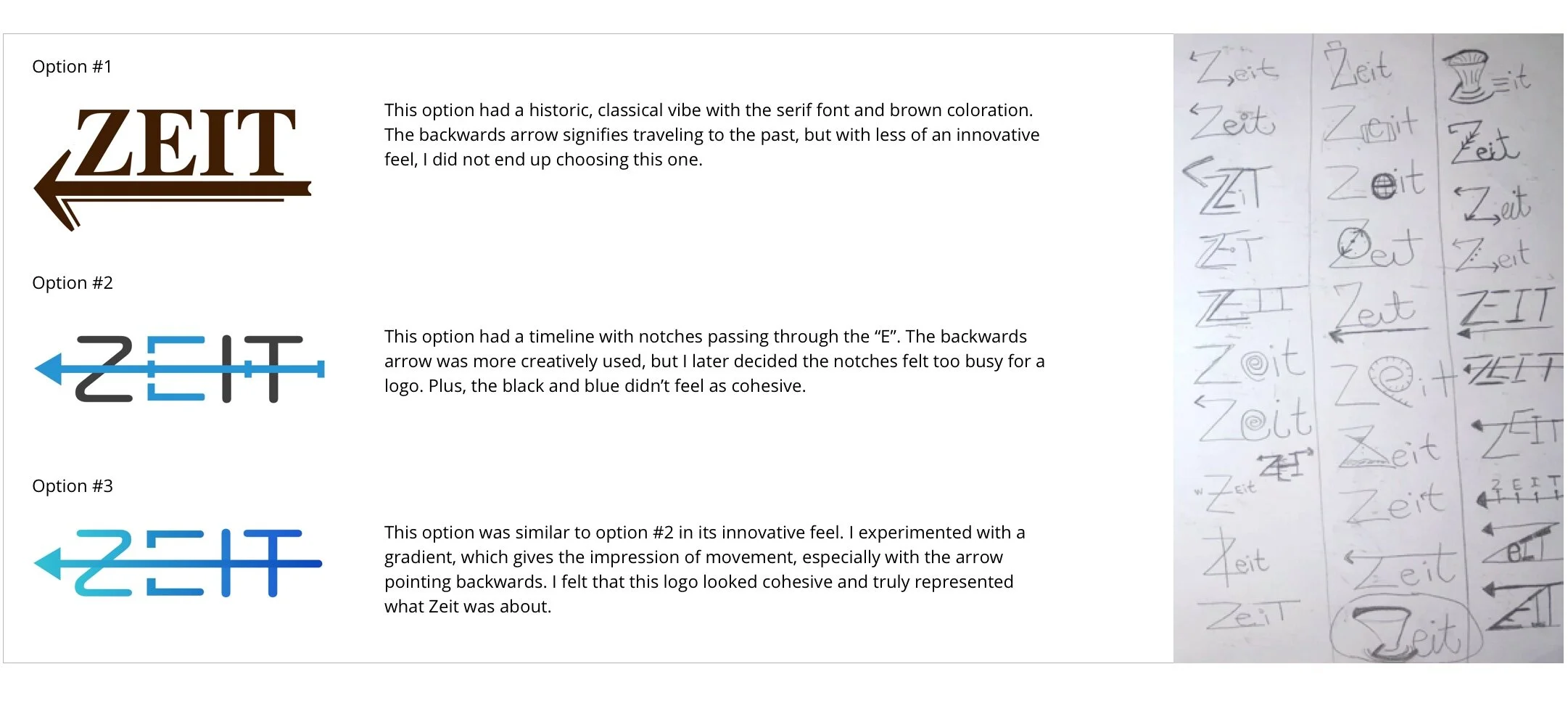
Logo Design
The logo creation was an iterative process, starting with descriptive word generation for the brand, and pencil/paper sketches. I then chose the 3 options I felt worked best, as detailed below. I narrowed my choices to the one I liked best, which was option #3
Responsive UI Screens
I designed 3 UI screens (although the “Trip Details” Page was only in the desktop version). Two shades of blue served as the primary and secondary CTA buttons, reflecting the brand color recognized in the logo. The homepage shows altering background colors to help organize the content. The trip cards show eye-catching images of the trips, as users would expect to see.

UI Kit

Test
Prototype | Usability Testing | Affinity Map | Priority Revisions
Prototype & Usability Testing
With the UI screens, I built this high-fidelity prototype in InVision. Note: This prototype includes the priority revisions that were made after the usability tests.

Affinity Map
This affinity map was created from the usability test results. The common and relevant themes served as the key findings, which were organized here on cards by category. This map will help determine which design changes will be made to the screens and prototype for an improved user experience.

Priority Revisions

— View More Projects —

