

Background
The Gift of Life Marrow Registry (GOL) is a public, non-profit bone marrow and blood stem cell registry that facilitates transplants for both children and adults suffering from life-threatening illnesses. GOL believes that everyone deserves a second chance at life, and it’s the voluntary donors who make that possible. Thus, to establish a more comfortable, organized, and uniquely donor-facing experience, the main focus of this project is to design an app that streamlines and consolidates all tasks required for work-up and donation. Understanding the general attitude towards the app, what features would be included, and how they can create for a less fragmented process will come through research.
My Role: Researcher, UX/UI Designer
Client: Gift of Life Marrow Registry (maintained real, professional relationship with client)
Project Timeline: 80 hours
Key Design Tools: Sketch, Figma
Goals
Design an end-to-end Gift of Life mobile application specifically for donors, generating a more organized and comfortable experience.
Enable donors to complete and manage steps of the work-up and donation process via a personal log-in and profile.
Through research, understand what features would be most useful to include in the app.
Parallel the tone, styling, and branding of Gift of Life, while still enabling the donor app to have its own personal flair.
Process

Research
Research Goals | Desktop Research | Survey | Interviews
Research Goals
Validate the assumption that donors would use and appreciate the app, and gain impressions on the app’s purpose and function.
Discover in what ways / to what extent the current system for managing logistics (regarding work-up and donation) is frustrating.
Uncover what features would be a good fit for the app, as well as how the information on the app could be more meaningful (to donors) than the general website.
Desktop Research
For secondary research, I familiarized myself with the donation process and gained knowledge that helps support the idea of creating an app specifically for donors.

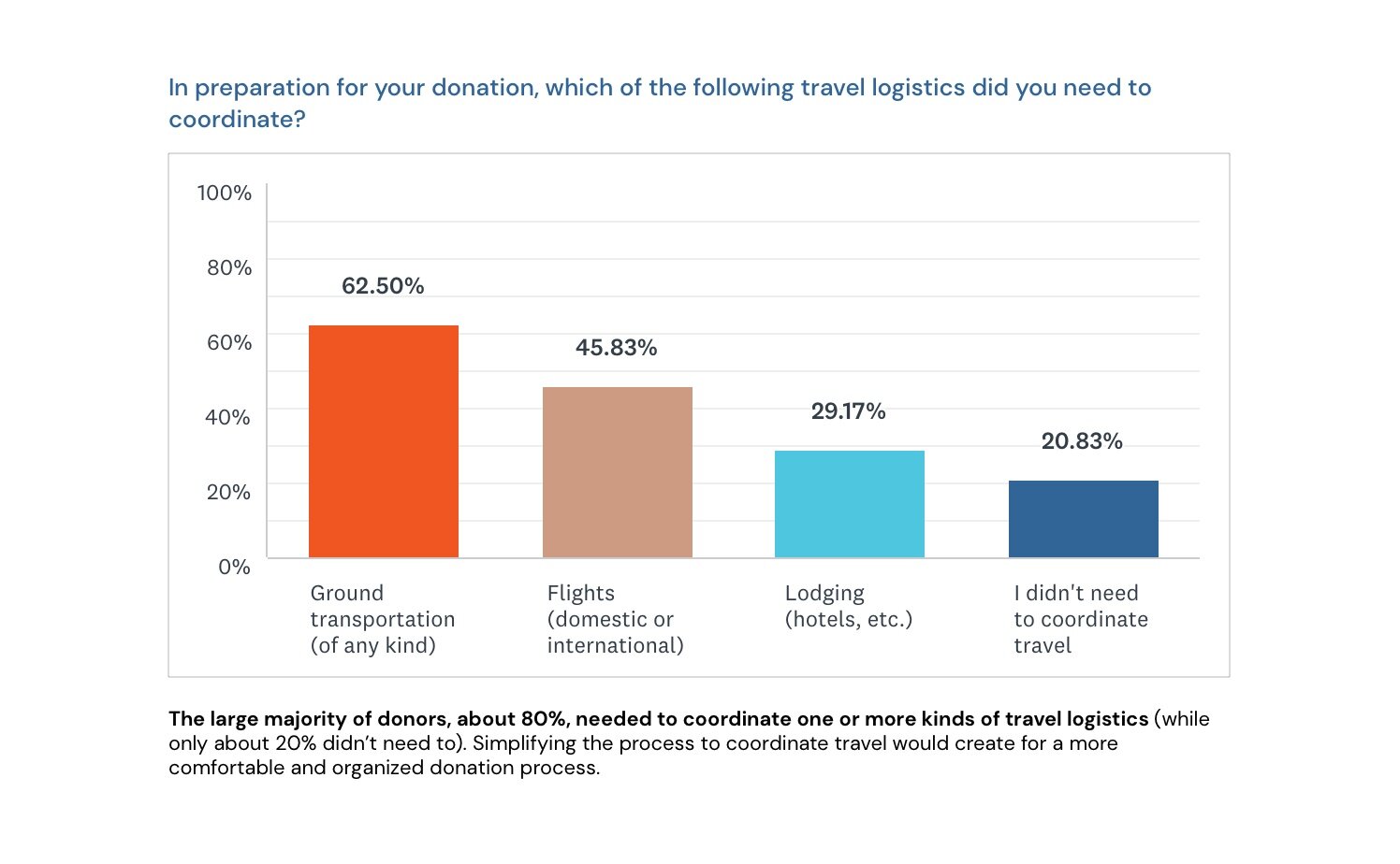
Survey
To gain insights about the tasks and coordination with the work-up and donation process, I wanted to hear directly from donors themselves. I created a survey and collected 24 responses from both bone marrow and stem cell donors. The target audience for my survey met the following criteria:
Males and females, ages 18-35
Gift of Life donors (i.e., people who have gone through the donation process–either the bone marrow transplant or stem cell procedure)
Individuals who are open to newer, more efficient ways of handling “bureaucracy” (as opposed to being strictly “old school”)
Individuals who have digital devices capable of downloading mobile apps


Interviews
To gather more qualitative research after the survey, I conducted 4 phone interviews with donors: 3 had previously done the stem cell donation, while 1 did the bone marrow procedure. I asked about both their prior experiences with the pre-donation and donation process, as well as their thoughts and insights regarding an app for donors. Below are the major findings, grouped by key theme (written in blue).

Define
Persona | Empathy Map | Sitemap | Task Flow | User Flow
Persona
With the research findings, I created a primary persona: someone who was called as a ”perfect match” and went through the work-up and donation process. While it was very satisfying to save a life, Eric acknowledges that it was a rather cumbersome process, having lots of details to coordinate and remember.

Empathy Map
I then created this empathy map to get a better sense of Matt’s actions, thoughts and feelings, and surroundings throughout the work-up and donation process. I additionally considered his pains and gains to garner a more holistic perspective. Empathizing with Matt helped to empathize with the broader target audience for heightened user-centered design.

Sitemap
This sitemap details the key pages (navigation) and the more specific features within the app for donors. Since the two flows for this project demonstrate scheduling appointments and coordinating travel, only those flows from the Profile will be fully designed.

Task Flow
I then created a task flow, which demonstrates the rather linear process of two key tasks: scheduling appointments and coordinating travel. This task flow begins after forms are submitted and approved, which begins the work-up process. The progress bar on the Profile screen will reflect that completion, and detail these two tasks as subsequent.

User Flow
I also created a user flow, which details the interactions and decision points for completing and submitting both the appointment schedule requests and the travel plan. Both processes include instructions and information to be filled. As illustrated on the task flow, donors will receive a notification (either mobile push notification and/or email) upon approvals.

Design
Low-Fi Sketches | Mid-Fi Wireframes | Logo Ideation | UI Designs - Wireflow | UI Kit
Low-Fi Sketches
I started the design ideation process by sketching the Log In and Profile screens. Then, I sketched various screens for both scheduling appointments and coordinating travel. Creating these low-fi wireframes helped to brainstorm and translate my design ideas on paper.

Mid-Fi Wireframes
I then took my sketches and translated them to mid-fidelity wireframes. Some of the key changes made since the sketches include:
Putting icons and instructions before listing the steps of the processes
Removing flights, ground transportation, and hotels as separate tabs to coordinate travel
Adding the PBSCs Info and Chat screens

Logo Ideation
One of the main project goals was to parallel the tone, styling, and branding of Gift of Life, while still enabling the donor app to have its own personal flair. I decided I wanted to iterate on the logo slightly, keeping the main concept in tact while giving GOL Donors a more unique identity.

UI Designs - Wireflow
I created a wireflow with the high-fidelity screens to show the interactions and relationship between them. In general, these UI designs remained consistent with the mid-fi wireframe design ideas.
Since there’s waiting time between scheduling appointments and coordinating travel, I will develop 2 prototypes that simulate a more realistic experience. The first two rows of this wireflow shown below are for scheduling appointments, which is required before coordinating travel (the second flow).

The second two rows of screens below are for coordinating travel, which comes right after the schedule has been approved and set by the donation coordinators. This flow (and prototype) begins with the user receiving a push notification, alerting about the schedule approval. He or she will then notice that the progress bar on the profile has been updated.
NOTE: The Chat and PBSCs Info screens shown in the last row are accessible at all times.

UI Kit

Test
Prototype | Usability Testing | Affinity Map | Priority Revisions
Prototype & Usability Testing
With the UI screens, I built the following two prototypes in Figma. Because donors must wait for their appointments to be approved and set by their coordinators before moving on to coordinate travel, I’ve designed two separate prototypes to better replicate the real situation. Both processes shown in the prototypes are required of donors, in this order, to be completed as part of the work-up prior to donation. They are part of the comprehensive flow that is reflected in the progress bar on the Profile page.
Note: These prototypes include the priority revisions that were made after the usability tests.

Affinity Map
I developed this affinity map from the usability test results. The common and relevant findings were organized by successes, roadblocks, and recommendations. All roadblocks and nearly all recommendations were considered for designs revisions.

Priority Revisions

— View More Projects —

