
Background
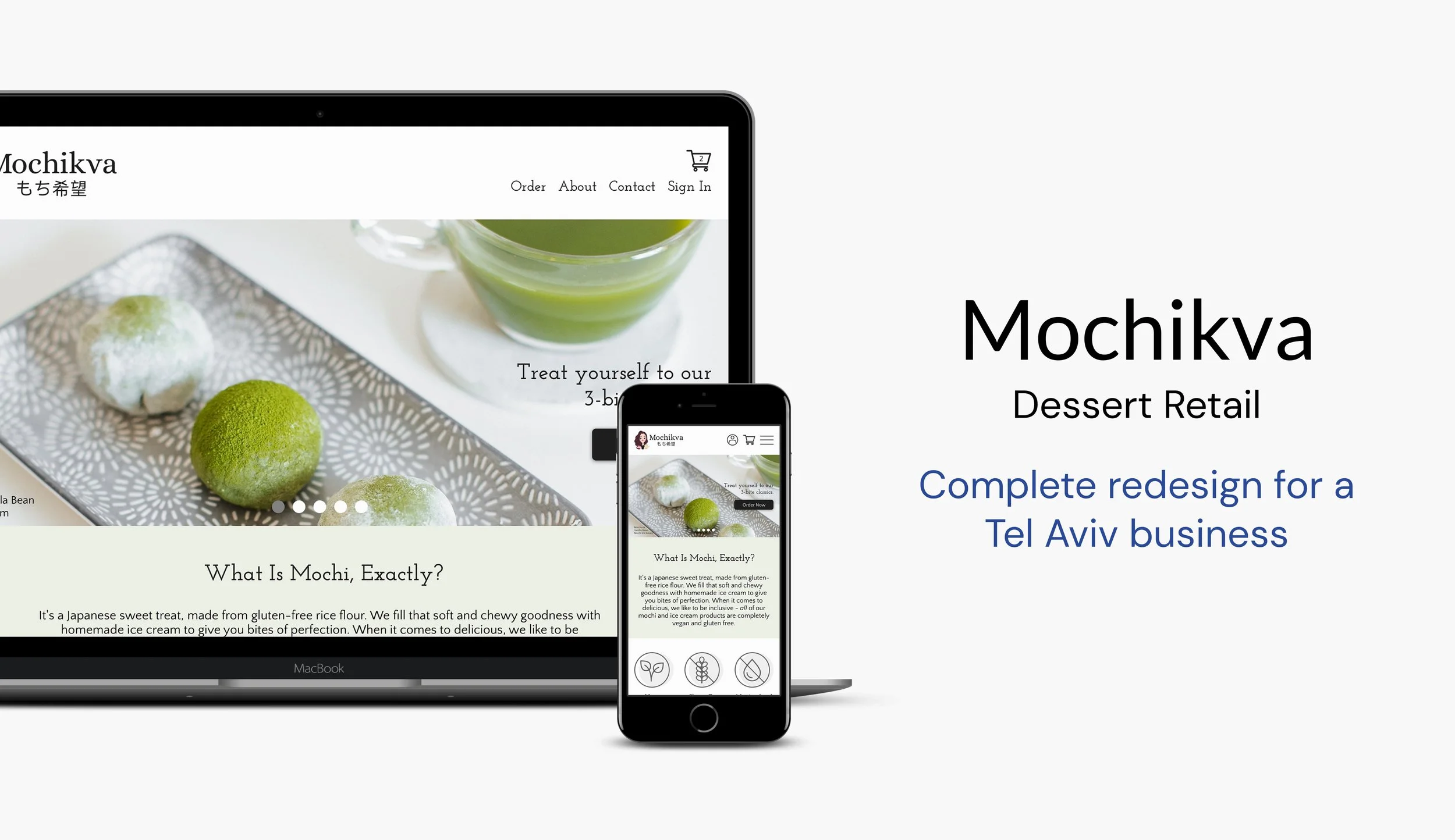
Mochikva is a small Japanese dessert business based in Tel Aviv, Israel. All products, which contain vegan-friendly and gluten-free ingredients sourced from local vendors, are sold through the Mochikva website as either home deliveries or in-store pickups.
While the products themselves are favored, the weak visual aesthetics and functionalities of the current Mochikva website generate a poor user experience.
My Role: Researcher, UX/UI Designer
Client: Mochikva (maintained real, professional relationship with client)
Project Timeline: 80 hours
Key Design Tools: Sketch, Marvel
Goals
Based in research, redesign the main pages of the website (Home, About, Shop/Order, Item Details, Cart, Checkout, Sign In, & Contact).
Redesign the homepage responsively (desktop, tablet, and mobile screen sizes).
Enhance the brand and styling while preserving the company identity.
Both improve existing features, and implement new ones to enhance usability.
Process

Research
Research Goals | Competitive Analysis | Interviews
Research Goals
Uncover expectations, motivations, and navigation behaviors for ordering food goods (e.g. desserts) online.
Understand users’ criteria to decide which ice creams/related desserts to buy.
Discover the pleasurable and frustrating aspects that users experience when ordering food goods online.
Seek first impressions of existing Mochikva website.
Competitive Analysis
For secondary research, I conducted competitive analysis with 5 direct competitors (Mochi businesses with online orders), and 7 other competitors (similar dessert businesses, both in and outside of Tel Aviv). To help make decisions on redesigning the Mochikva website, I examined how and to what extent these 19 features are utilized across the market.

Key Insights:
75% of competitors do not have filter options beyond categorizing the products into their basic types or flavors. For the other 25%, there are too few products being sold for the filter options to appear meaningful.
Less known products (e.g. “mochi” or “honey-cocoa bars”) are explained, as well as show ingredients and/or nutrition facts for their special composition.
Special packaging information is provided for some products that can melt.
One-third of the competitors show customer reviews in some capacity, which add value when utilized well.
Two-thirds of all competitors have an “add notes/instructions” feature, which is very helpful for delivery.
Two-thirds of all competitors include a delivery date/time picker online.
75% of competitors enable users to apply coupons, and half enable users to pay by means beyond a credit card (e.g. PayPal, Google Pay, or cash).
Interviews
I conducted 4 interviews with men and women in Tel Aviv, ages 25-28. To maximize the value by engaging with potential customers, the target participants met the following criteria:
Young adults, both men and women
English speakers that live in Tel Aviv, Israel
Individuals that love ice cream/similar treats
Individuals that are health conscious and/or value quality, local ingredients
Individuals that often make purchases online (particularly food goods)
Key Insights:

Define
Persona | Feature Roadmap | Sitemap | Task Flow | User Flow
Persona
Using the research findings, I created a primary persona – a realistic customer of Mochikva products. Noy lives in Tel Aviv and aims to lead a healthy lifestyle. Her busy schedule makes ordering food and treats online convenient, but it’s important that the process is very user-friendly.

Feature Roadmap
From the interview and competitive analysis insights, I created this feature roadmap. All features are grouped by priority and page in which they’d be found. Some of these features already exist on the current Mochikva site, but need improvement. Some features here are new, while other existing features would be removed in the redesign for their lack of value.

Sitemap
This sitemap visually details how the pages and features would function together on the redesigned site.

Task Flow
I created a linear task flow to illustrate the steps that would be taken to purchase Mochikva products online.

User Flow
This user flow shows the interactions and decision points that would occur within the redesign.

Design
Low-Fi Sketches | Mid-Fi Wireframes | UI Designs | UI Kit | Brand & Styling Revisions
Low-Fi Sketches
To start the ideation process, I sketched numerous versions of the different pages I planned to redesign. I used my feature roadmap and sitemap to help build out these low-fidelity wireframes, and kept in mind the users and their logical flow. Below is one sketch of the following pages: Home, Order, Checkout, About, Cart, and Item Details.

Mid-Fi Wireframes
For these 6 main screens, I translated my sketches into mid-fidelity wireframes. Note: for the Contact page and Sign In modal, I built out only the UI designs (with extra time toward the end of the project – these screens are also included in the final prototype).

Mid-Fi Wireframes - Responsive Homepage
I designed the homepage responsively. For the mobile screen size, the top navigation links are found in the hamburger menu, and the ingredients icons transform into two lines. I decided placing the logo in the top-left, with the navigation links in the top-right, was a better fit for this design across the whole site.

UI Designs
I added UI designs and created content for these 6 main pages. Key changes made since the mid-fidelity wireframes include:
Changing the top nav structure.
Creating a more suitable icon set for Homepage ingredients.
Making product cards appear in rows of 4, instead of 5.
Alternating the images/text in the About page.

UI Designs - Responsive Homepage
I also added the UI designs to the responsive homepage screens. Once the colors and stylistic elements were included, I changed the light green background to appear in 4 “rows” (compared to the 3 shown in the mid-fidelity responsive screens). Besides that difference, and both the hero image text and icon set changing, all other components from the mid-fidelity screens relatively stayed the same.

UI Kit

Branding & Styling Revisions (Key Changes)
One of the key project goals was to enhance the brand and styling while preserving the company identity. As per the requests of Mochikva’s owner, I kept the logo image of the girl (with minor modifications), and used the same brand color in the designs. Other aspects of the logo were changed, as well as the color palette, buttons, and navigation among other UI elements. The previous design lacked cohesion and consistency, so the redesigns were an attempt to tighten things up and create for an overall more professional site with a better user experience.

Test
Prototype | Usability Testing | Affinity Map | Priority Revisions
Prototype & Usability Testing
Note: This high-fidelity prototype includes the priority revisions that were made after the usability tests.

Affinity Map
I developed this affinity map from the usability test results. The common and relevant findings were organized here on cards by category. While certain recommendations could not be implemented (e.g. images used were given by Mochikva, so updates are out of the project’s scope), others were considered for design revisions.

Priority Revisions (& New Screens)

— View More Projects —

